I undertook a project to analyse the ratings of FIFA players from a public dataset. The analysis assessed the following goals outlined prior to cleaning the data:
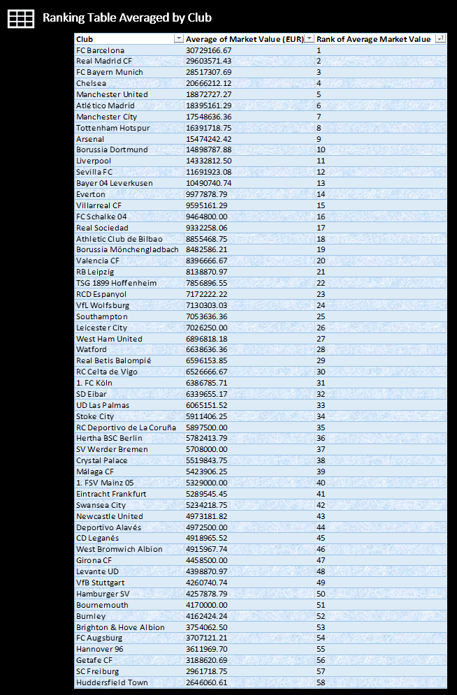
Ranking table with market values averaged by club – which clubs are distinctively different at the top?
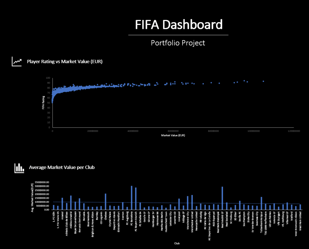
What is the correlation between overall rating and market value?
What is the average market value of players per club?
Once the data was cleaned, prepared and analysed, a dashboard was created using Excel as seen in the image below.
As part of the dashboard, a table of the Average of Market Value in Euros by club was created:
The steps of the cleaning and data analysis can be seen below, so anyone can attempt this in the future themselves:
FIFA players 2017 data analysis project
Columns – name, club, age, league, height, body type, market value EUR, fifa strength score, game effort
- Create a scatterplot to show relationship between fifa strength score and market value –
Click the Insert tab, and then click X Y Scatter, and under Scatter, pick a chart. With the chart selected, click the Chart Design tab to do any of the following: Click Add Chart Element to modify details like the title, labels, and the legend.
- Ranking table with market values averaged by club – which clubs are distinctively different at the top?
- Plot distribution of overall ratings for all players (scatter)
- Correlation between overall rating and market value?
Observe the data and prepare for analysis
- No blank values
- All columns containing number formatted to number from general
Use line charts for trends, column and bar chart as needed.
Build pivot tables and charts then a dashboard using excel or tableau
Create a dashboard using text boxes and a background photo, hide gridlines and add all necessary graphs and tables to the dashboard to show an overall visualisation of the data.
Create a new tab, name it ‘Line Chart’ to know to search for it later. Click on any cell and go to ‘Insert’ then click Pivot table.
